Automattic recently welcomed Beeper, an all-in-one messaging app, to our umbrella of life-improving apps. (If you haven’t yet, check out Day One, Pocketcasts, and Tumblr, too!)
Since Beeper joined a company best known for its world-class WordPress hosting and plugin solutions, we knew our special projects crew would love creating a shiny new blog for the messaging team.
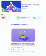
With blog.beeper.com, our team showed off what can be quickly done with a minimalist framework. In this post, we’ll give you a short tour of the new site, including some design inspiration as well as before and after shots.
Take a look at Beeper’s new blog and remember to download the app today on iOS, Android, or desktop.
Maintaining Beeper’s clean and colorful aesthetic
Beeper’s design sensibility has always been fun and playful, featuring a blue-purple color palette, simple icons, and friendly imagery and messaging. We knew we didn’t need to reinvent the wheel on that front, so we maintained the overall aesthetic while giving the new blog a clean background that’s ideal for reading and absorbing content. The Beeper homepage, in comparison, offers a colorful, sparkly background that’s perfect for immediately drawing in visitors.

Rather than complicate the design with a noisy layout, the team quickly decided that a one-column, minimalist structure using the popular Livro theme would be best for this project. The only custom flourish we’ve added is a simplified “Featured” section that the Beeper team controls and edits.
Breaking free of Substack’s constraints Beeper’s old blog at Substack is shown on the left, and at WordPress.com on the right. The first iteration of Beeper’s new blog didn’t include the featured section at the top. With WordPress, a design can always be reimagined and improved, even after launch day.
 We transferred Beeper’s 7,000+ subscribers and all their archived content from Substack to WordPress.com. Our system beautifully handled those moving pieces and even ensured that all the links worked properly at their new home.
Moving Beeper off of Substack and onto WordPress made this project unique for our team. Along the way, we realized some of Substack’s constraints, like styling and layout restrictions, and were glad to be able to move beyond them.
On the design front, for example, Beeper appreciated having more freedom than Substack’s pre-built, busy-looking magazine layout. And while there was some customization available, little details like the “Subscribe” box or even a “Download” button couldn’t be styled with Beeper’s branding aesthetic. These details do a lot to present a distinct and cohesive message.
While it’s a subjective measure, we’re comfortable in saying the new design just feels better and more authentic to Beeper.
Start using WordPress.com todayIf you’re impressed by what our team did with Beeper’s blog, consider moving your blog or newsletter to WordPress.com today. With our convenient importer tool, you can click a button, sit back, and dream about just how high your content can fly when not constrained by a platform’s built-in limitations.
And if you’re curious about using WordPress.com to build sites for your clients, click below to learn more about our world-class hosting and development features:
Start building


